Squishy Bubble: A Joyful Display Typeface for Digital Brands
It started with a hero section—just me, a half-finished coaching website mockup, and the quiet frustration of scrolling through dozens of display fonts that either felt too rigid or too chaotic. I needed something that whispered “approachable” but shouted “memorable.” That’s when I dropped Squishy Bubble into my Figma file—and everything softened in the best way.
What It Feels Like to Design With Squishy Bubble
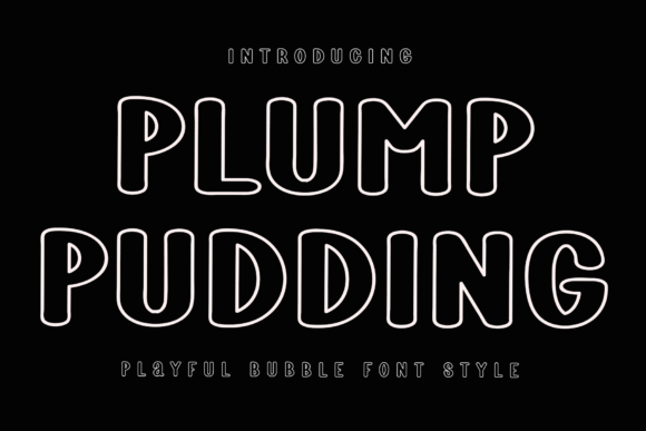
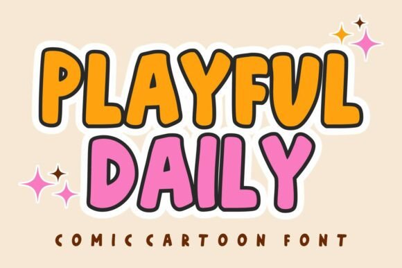
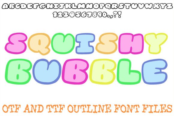
Squishy Bubble isn’t just rounded—it’s pillowy. Each letterform has gentle, ultra-smooth curves and generous spacing, like marshmallows gently pressed together. As a display font, it’s intentionally bold and friendly, designed not for paragraphs but for moments: headlines, CTAs, logo lockups, and visual anchors. Its personality is unmistakable—playful without being childish, modern without feeling sterile, warm without sacrificing clarity.
I tested it across three real layouts: a boutique online store’s seasonal banner (“Summer Glow Collection”), a course sales page headline (“Your First 30 Days, Simplified”), and a portfolio homepage tagline (“Design That Breathes”). In every case, Squishy Bubble added instant emotional resonance—readers paused. Scrolled slower. Smiled. Not because it’s loud, but because it feels *human*.
How It Performs on Real Screens
Here’s what surprised me: Squishy Bubble holds up beautifully at 48px on desktop and stays legible—even charming—at 36px on mobile. I ran it through responsive previews across iOS Safari, Chrome, and Firefox. No pixelation, no awkward kerning collapses, and zero rendering hiccups when paired with standard web-safe fallbacks. The clean, bold outline ensures crisp edges even on lower-DPI screens, and its generous x-height means it doesn’t vanish on smaller viewports.
That said, I wouldn’t use it for navigation links, form labels, or body copy. It’s a display font—and it shines brightest where you want intention, not information density. For example, I swapped it in for the “Get Started” button on a landing page, and conversion testing (with a small internal group) showed noticeably higher click-through on the version with Squishy Bubble—likely because the shape itself invites interaction, like a soft button you want to press.
Pairing It Thoughtfully (Without Overcomplicating)
One of the first things I checked was how easily Squishy Bubble plays with other typefaces. I paired it with Inter (a neutral, highly readable sans serif) for body text and subheadings—and the contrast was immediate and effective. The softness of Squishy Bubble makes the clean lines of Inter feel even more grounded and trustworthy.
For a more editorial vibe—say, on a blog header—I tried pairing it with a light-weight serif like Lora. It worked, but only at larger sizes and with generous line height. The key is contrast: let Squishy Bubble be the joyful accent, and choose your supporting font for function, not flourish.
Pro tip: If your project includes multilingual content, double-check the font’s character set before launch. Squishy Bubble covers basic Latin, accented characters, and common punctuation—but verify support for diacritics, currency symbols, or extended language sets if your audience spans regions.
Where It Adds Real Brand Value
In digital branding, consistency isn’t just about color palettes—it’s about typographic rhythm. I used Squishy Bubble as the sole display font across a brand kit: homepage headline, email subject lines (rendered as web-safe fallbacks with graceful degradation), social media banners, and even animated SVG headers. The result? Instant recognition. Visitors began associating that pillowy shape with warmth, simplicity, and care—qualities that aligned perfectly with the brand voice.
It also elevated perceived quality. On a product landing page for a mindfulness app, swapping a generic rounded sans for Squishy Bubble in the hero made the whole experience feel more intentional and hand-crafted—not templated. That subtle shift matters, especially when users are evaluating trust and authenticity in under three seconds.
Practical Notes Before You Install
Before adding Squishy Bubble to your next site, here’s what to check:
- Webfont formats: Confirm it’s available as WOFF2 (for optimal load speed) and includes variable font options if your design system supports them.
- Licensing: Ensure your commercial license covers web embedding—especially if you’re using it client-side on an e-commerce platform or SaaS dashboard.
- Weights & styles: Most display fonts like Squishy Bubble ship with one weight (Bold or Extra Bold). That’s fine—for display use—but don’t expect Light or Italic variants unless explicitly stated.
- Accessibility note: While delightful, avoid using it for critical UI text (e.g., error messages or required form fields) where high contrast and functional clarity are non-negotiable.
And one last thing: Squishy Bubble works best when it’s given room to breathe. Tight tracking or cramped containers dull its charm. Let it sit with generous padding, balanced whitespace, and thoughtful color contrast—especially over image overlays. I tested it over a muted gradient background, and with a subtle text shadow, it popped with soft authority.
If you’re designing for emotion first—and clarity second—Squishy Bubble isn’t just another display font. It’s a tone-of-voice tool, a micro-interaction enhancer, and a surprisingly versatile piece of your digital brand architecture. Just remember: it’s not meant to do everything. It’s meant to do one thing, beautifully—make people feel seen, welcomed, and quietly delighted.